NSW SMART SENSING NETWORK
Annual report design for the network using smart sensing for a smarter world
What we did:
Annual Report Design
Cover Design
Creative Direction
Infographic Design
The Client
The NSW Smart Sensing Network (NSSN) was established in July 2016 with funding from the NSW State Government through the Office of the Chief Scientist & Engineer.
It was founded on the premise that the economy and people of New South Wales face key challenges in energy, resources, manufacturing, the environment, transport, agriculture, space and health that cutting-edge research in smart sensing could play a critical role in solving.
The market for smart sensing across a broad range of industries is immense and growing. The NSSN brings together the world class research taking place in NSW universities with state government agencies and industry to develop innovative solutions to these key challenges and, at the same time, position NSW as a leader in sensing technology.
The Brief
NSW Smart Sensing Network approached COG Branding with a brief to design the network’s annual report for 2021/2022.
The annual report is a document containing all the results, communications and events from the network throughout the specified period of time. This assists NSSN to communicate to their relevant audience and target groups, presenting their findings from internationally recognised programs.
It was integral that COG Branding presented a clean and sophisticated direction for the report, as the content and network itself is aimed towards intelligence and educational-based groups and communities.

The COG Design Solution
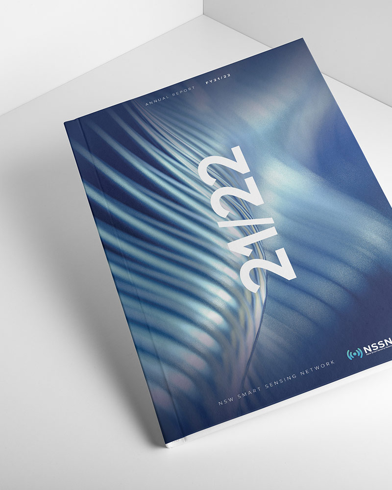
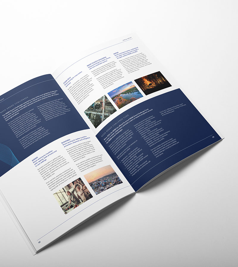
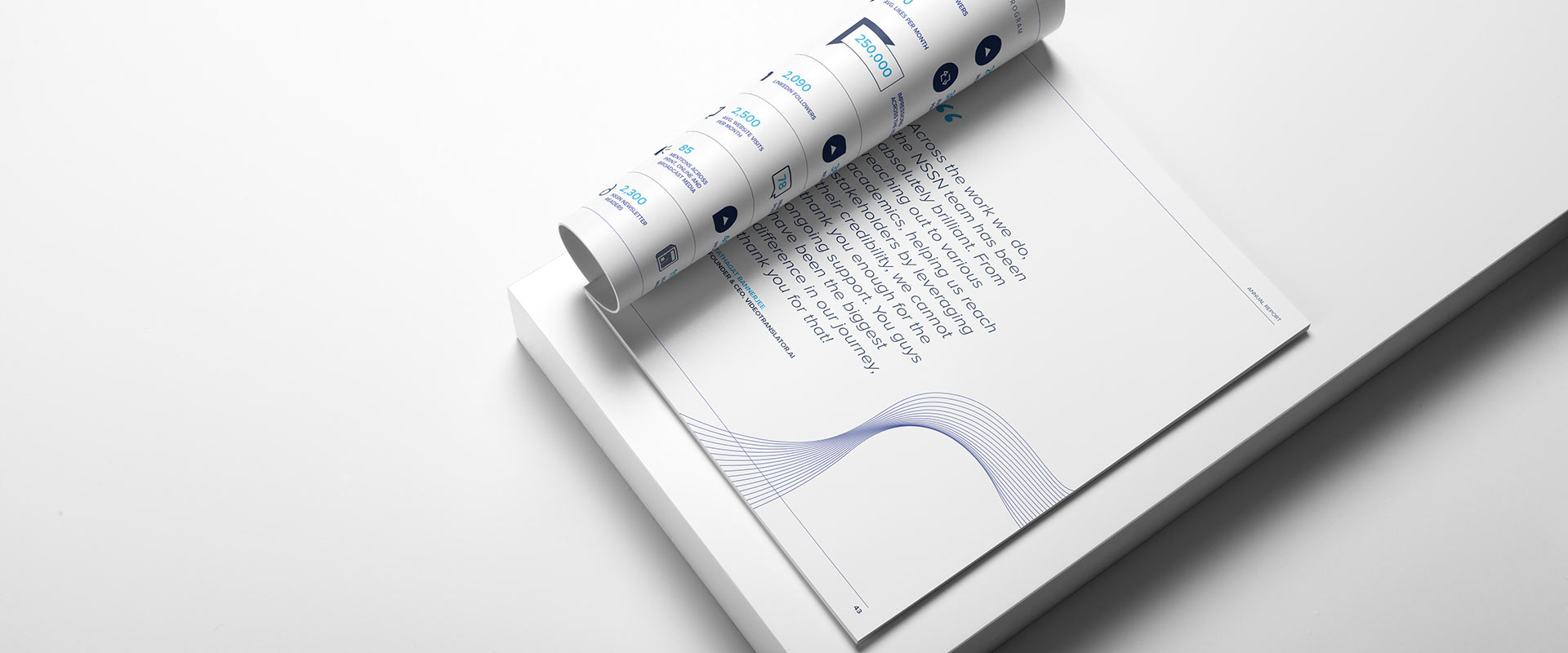
The COG Design solution focused on a dynamic and contemporary creative direction that communicated the Network’s content clearly whilst remaining interesting and engaging.
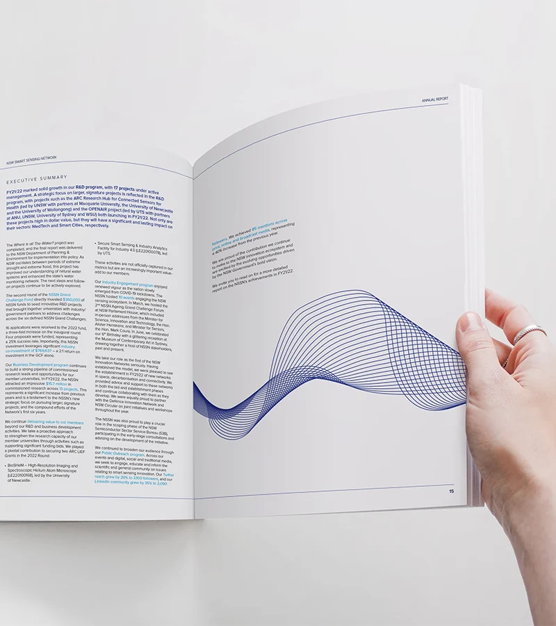
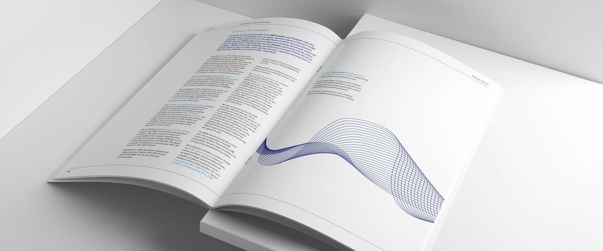
A suite of graphics were created to give pages a sense of movement and progression, reflective of the Network’s work and nature. This was paired with the colour palette of the brand, utilising corporate shades of blue that keep the look clean yet innovative.
Once these design assets were established, it was essential that the content and communicative elements were kept as simple as possible. COG Design emphasised the importance of white space throughout the document, letting the content breathe and allowing each aspect of the design to exist in its own unique way.
Once put all together, the result was an innovative, dynamic and clean document that reflected the nature of the Network.
The Results
Delivered with success!
NSSN were thrilled with the look and feel of the 21/22 edition of their annual report. With minimal feedback and need for re-design, the creative direction presented by COG Design proved to be a strong foundation from the outset. With slight changes in the content throughout the process, the design supported these changes all the way through the project, allowing for refinement to be a breeze.
