TAREN POINT BOWLING CLUB
Giving a fresh rebrand to the local favourite
What we did:
Communications Strategy
Brand Direction
Corporate Identity
Visual Identity
Language & Positioning
Brand Guidelines & Handling

The Client
Located in the heart of the Sutherland Shire, Sydney NSW. Taren Point Bowling Club is a locals favourite, a fantastic entertainment venue and Bowls NSW Club of the Year.
The club boasts beautifully manicured bowling greens and fantastic facilities with a relaxed, friendly and intimate atmosphere. You can enjoy the great food and refreshments from the Bistro and Bar while relaxing in our fantastic indoor and outdoor spaces and newly created areas.
Members of Taren Point Bowling Club and their guests enjoy excellent bowling facilities and club camaraderie. The From 1950 until the present Taren Point has and will always welcome anyone that wants to join the Taren Point family.

The Brief
Taren Point Bowling Club had experienced volatility during the pandemic and had not pivoted their branding during this time. Emerging from the pandemic restrictions and operating environment the club needed to address their brand, ensuring that their messaging to customers was clear, bringing a refreshed form of communication whilst maintaining business as usual.
Taren Point Bowling Club needed to rebrand and engage a Communications Strategy to reestablish the brand position. COG Branding inherited a legacy of very little brand intelligence and some analogue and basic brand management systems and processes. COG Branding’s focus was to understand the business case, the club’s audience and patrons, the way they currently communicated and the general view that the public had of the business.
COG Branding’s job was to ensure Taren Point Bowling Club were set up for as little disruption to their BAU as possible, a key part of the brief would be to support the General Manager in their objectives and vision to allow the business to begin performing post-Pandemic.
Taren Point Bowling Club is a typical Clubs NSW industry business which follows standard rules and regulations, thus COG Branding’s design and brand assets needed to conform to this environment.

The COG Design Solution
The refined language suite for Taren Point Bowling Club utilised the direction established in the Brand Strategy.
This ensured the core intent to offer more emotive statements that offer a deeper engagement opportunity for patrons to understand what makes Taren Point Bowling Club unique and special.
With this suite of brand language, it offered the brand a chance to communicate with an emotional asset class, supporting the current transactional business asset class – that today works on its own.

Creative Assets
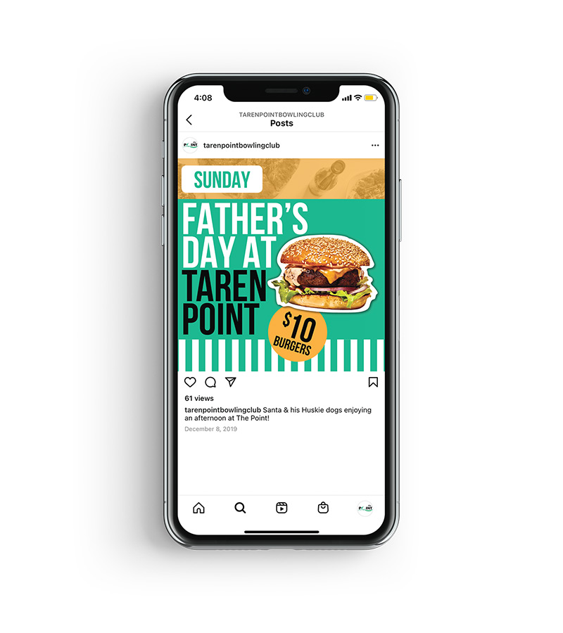
COG Design’s brand direction for Taren Point Bowling Club allowed for a new suite of creative assets to be created. The ‘Gathering Pattern’ was established as a graphic element to tie in the concept of inclusivity and togetherness, as well as directly showcasing the revised colour palette. This communicates directly to the diversity of patrons that the Club is fortunate enough to have.


The ‘Awning Stripes’ reflects the physical attribute of the Club’s bowling green awnings. With a strong roster of events, celebrations and entertainment, the stripes deliver against the club’s requirement of a more contemporary feel that speaks to the celebratory nature of many of the patrons visits.
The ‘Reality Check’ and ‘Slap-On’ stickers provide a refreshingly simple yet effective method in cutting through the more transactional offers the club is renowned for. The Reality Check was specifically designed to allow an emotional layer of the brand to work in conjunction with the transactional elements of the business. This tactic made no effort in hiding the fact that the offer is a priced pointed, simple and nothing grand offer.

The club’s previous branding was limited in it’s ability to convey emotion via the colour palette. Our proposed colour palette and overlay method saw the delivery of a deeper brand experience that pushed across a sense of atmosphere, reflective of the experiences in the club felt day-to-day.
The ‘Day-Time-Offer (DTO)’ was created to provide a refreshingly simple yet effective method in providing critical information of offers and general details that works across all touchpoints and executions.


Bistro At The Point Menu
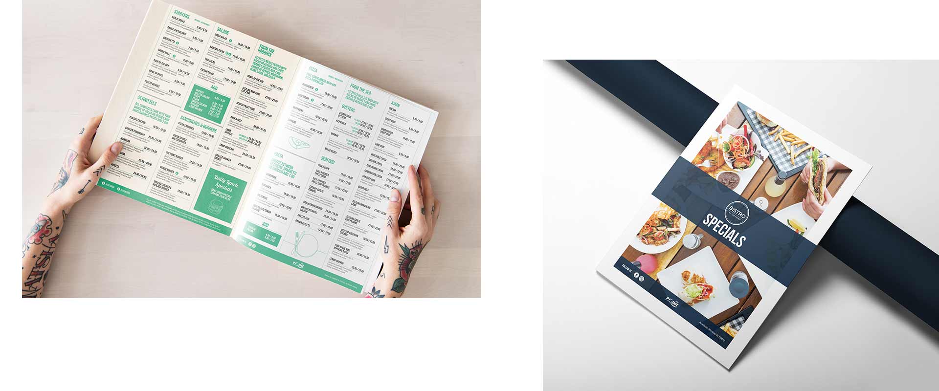
COG Design also needed to come up with a solution for the new-look menu for The Bistro At The Point. With a number of menu items added and updated, the new menu needed to be functional and clear for all returning and new patrons whilst utilising the new branding.
Menu Suite
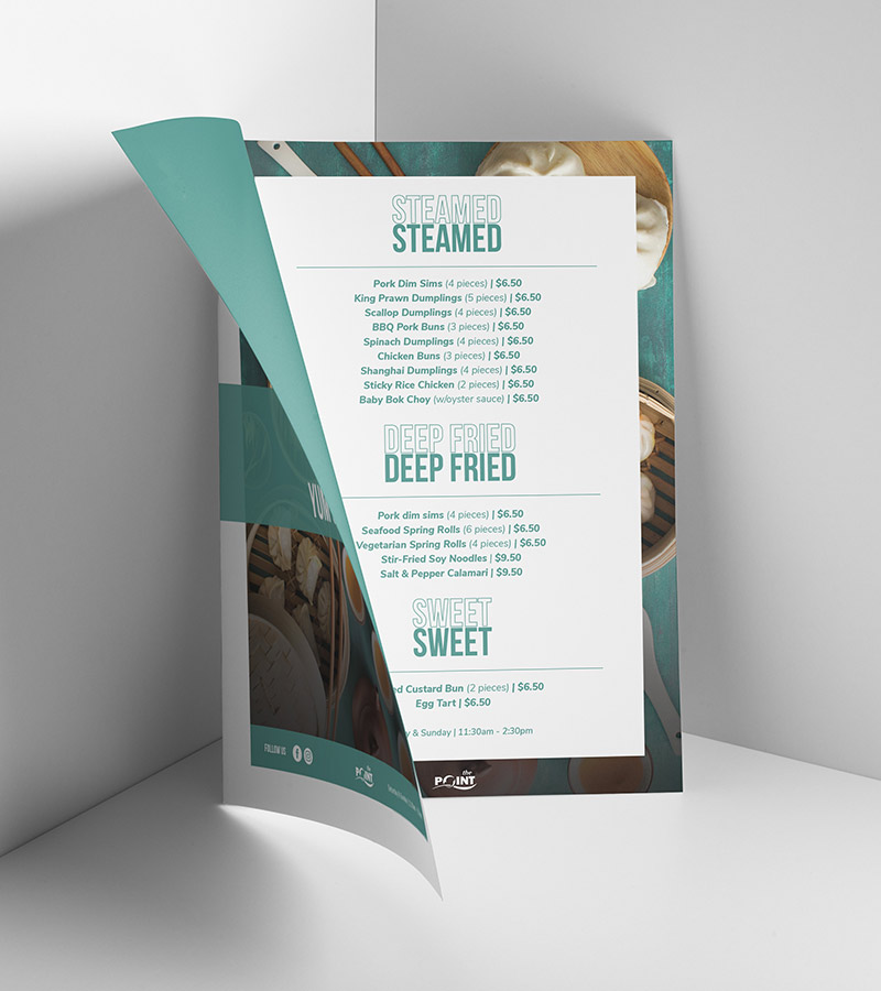
Along with the new menu for The Bistro At The Point, Taren Point Bowling Club also needed a refreshed suite of menus that included Specials, Yum Cha and the Wine List. These menus kept a similar look to ensure a suite was maintained, whilst also keeping a unique look to be easily identified as different menus for the patrons wanting to order from different sections of the club.
In-Club Offerings
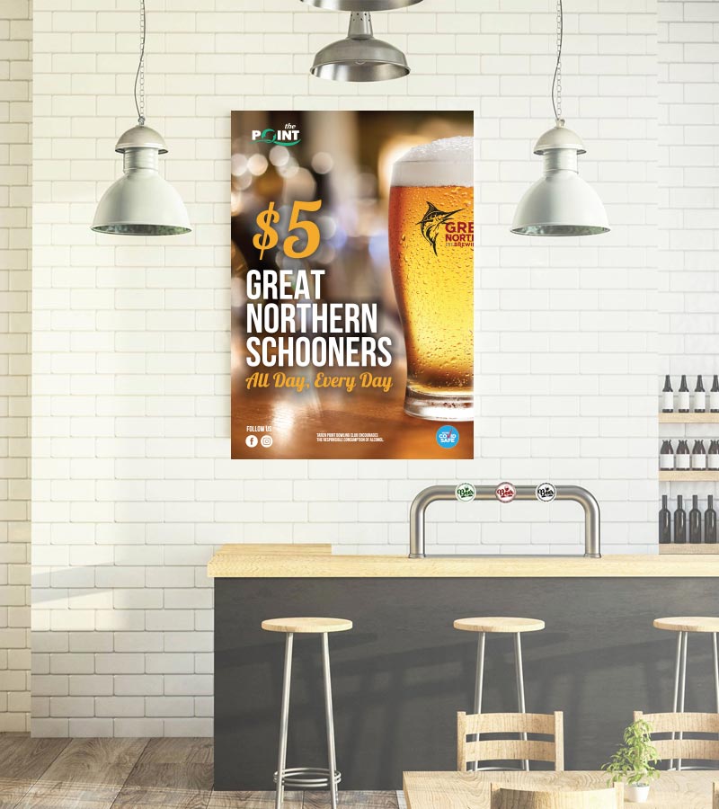
To ensure Taren Point Bowling Club’s BAU continued without disruption, the new branding was applied across the club’s range of offerings. Throughout the year, TPBC offers a range of seasonal events and specials, all of which are advertised around the club. As a priority, the visuals for the offerings were redesigned to ensure the club’s BAU schedule was not disrupted.

Corporate Stationery
COG Design designed the new business cards for the Taren Point Bowling Club staff. Cards needed to remain clean and minimal, keeping the identities of both The Point and Bistro At The Point at the forefront. The flat colour concept of the cards helped to bring the design into a more contemporary look whilst the new typeface brought the staff’s names and details of the Point to an elevated level.

Coasters
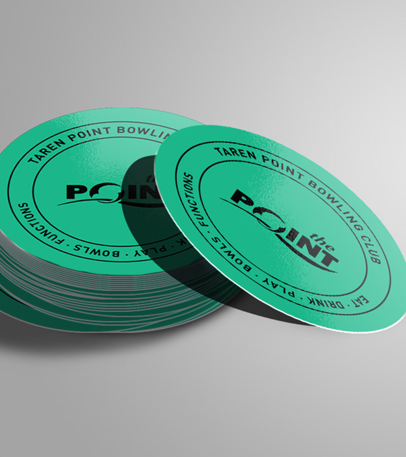
Taren Point Bowling Club’s coasters were also in need of a visual overhaul. The TPBC green was used as the primary colour for the front of the coaster, whilst the back was kept white to allow for patrons to provide written feedback. This encouraged communication between club and customer through all brand assets both digital and physical.
Blade Signage
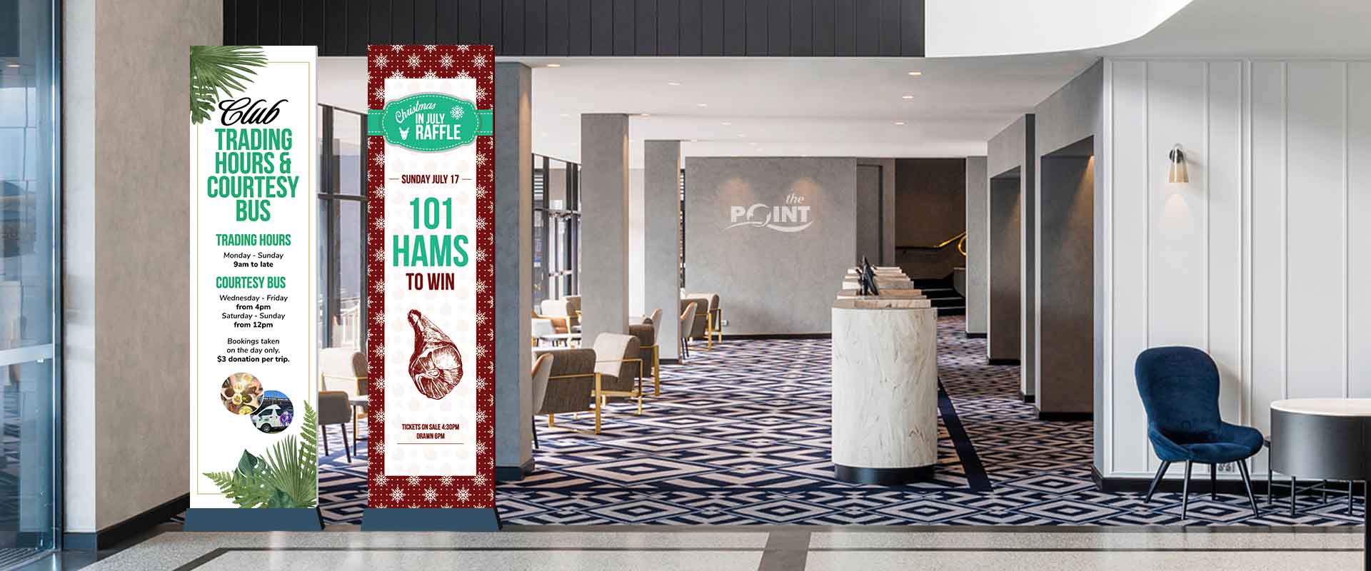
To ensure Taren Point Bowling Club’s BAU continued without disruption, new blade signage was created to introduce the refreshed branding across the club’s range of offers. Seasonal events (101 Hams Raffle) and general information (Trading Hours) were designed in a way that caught the attention of patrons upon entry to both communicate the club’s offerings and ensure the new look is established from the first moment of the visit.
Social Imagery
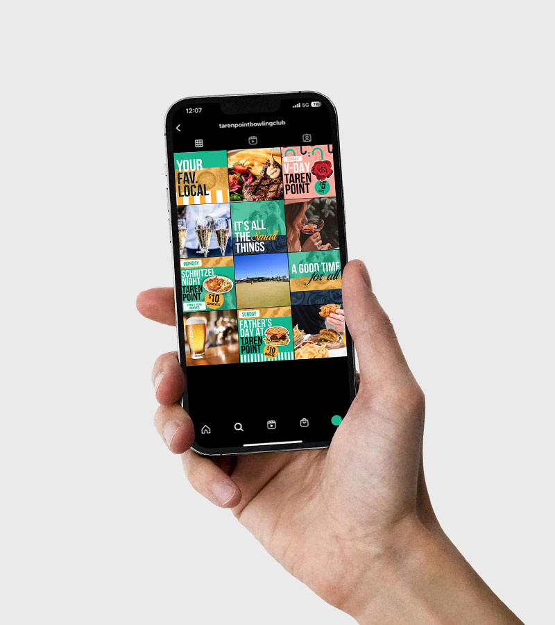
An important aspect of the rebranding of the club was their social presence. COG Design had a the task to overhaul TPBC’s social content, aiming towards more emotional communication and imagery as well as transactional graphics that engaged the patrons looking for value from their local. The imagery boasts a bright and vibrant appearance that moves the club into a new light within the hospitality space.
TPBC Website
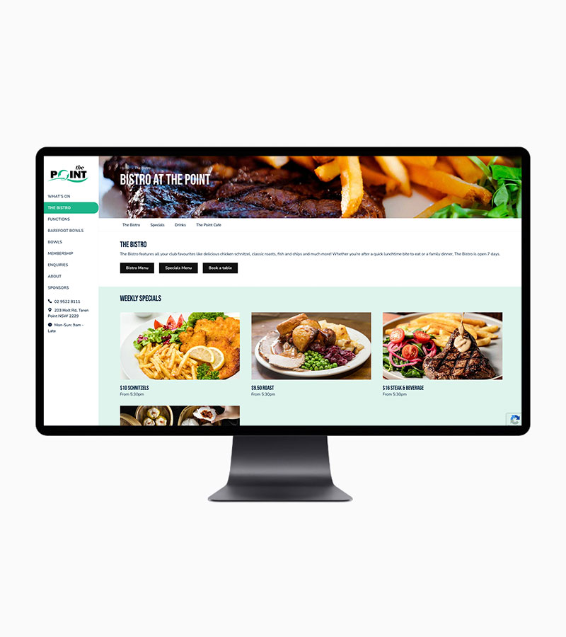
Taren Point Bowling Club’s website was also in need of a major overhaul for both brand and performance. COG Digital worked to create a website that is clear in it’s brand communications, navigation and performance. The imagery and clean layout of the site reflects the contemporary space that the design has allowed the brand to move in to.
COG Branding’s Strategy for Taren Point Bowling Club
Taren Point Bowling Club now manages a marketing communications strategy that is circulated within the business senior management and marketing team as a plan that ensures strategic communication takes place with their targeted audience.
The Taren Point Bowling Club brand and business strategies assisted the business to define the communication objectives, refine the audience and articulate the brand messages to clients, customers and team members.

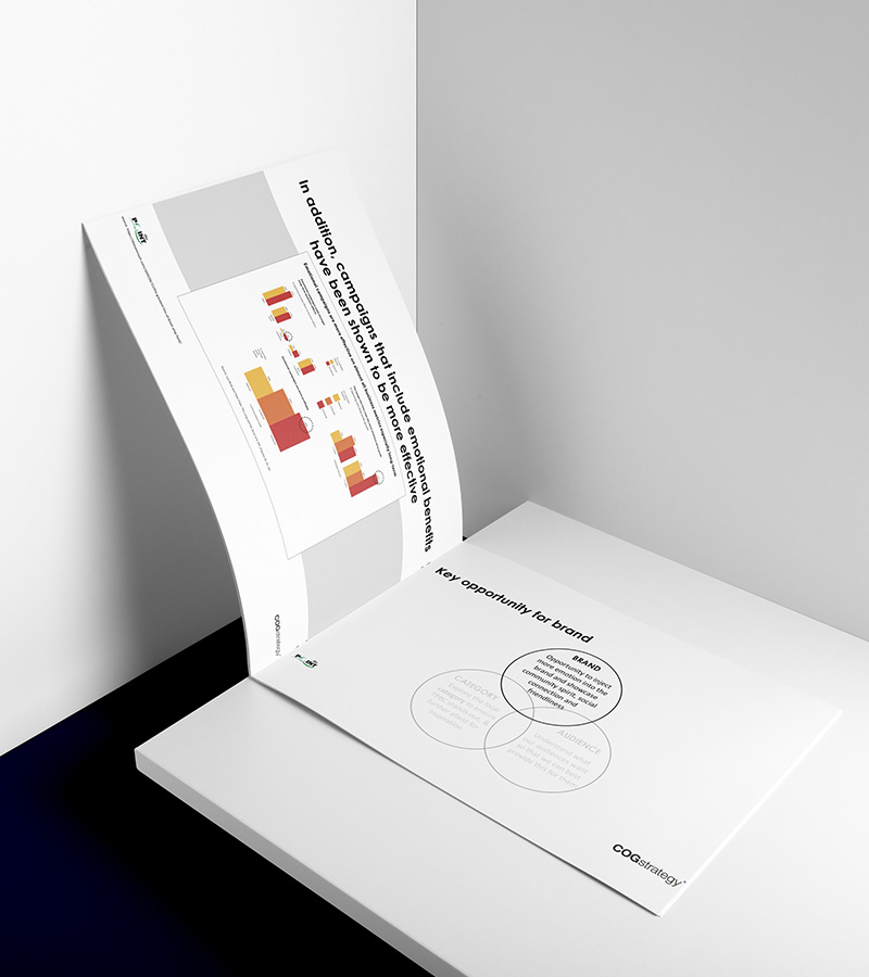
The Business Development project included brand management frameworks that clearly define who Taren Point Bowling Club should be talking to (both employees and customers), clarification on why the business is wanting to talk to them, how and when Taren Point Bowling Club will deploy marketing campaigns, and a rationale on media type and advertising budget.
The discoveries made within the Taren Point Bowling Club Business Development project delivered key research and insight which offered COG Branding client a dashboard of current business and brand information, and as per the initial brief was able to then be rolled into other projects such as digital marketing workflows and website technology upgrades.